13 Common Web Design Mistakes That Drive Visitors Away
By Ben Delp
Marketing Department
Table of Contents
Your website is often your first shot at making a connection – blow it, and your prospects might not be back. Research shows you’ve got less than a second before users start forming judgments. If your website design feels clunky, confusing, or outdated, it might be working against you instead of for you.
Small web design mistakes add up quickly, and they often cost you trust, leads, and website traffic. Here are 13 website mistakes to avoid and how to fix them
Mistake #1: Confusing Navigation
What It Looks Like: Too many elements in the menu. No clear hierarchy. Important web pages buried three clicks deep.
Why It’s a Problem: Users scan, they don’t study. If visitors can’t find what they’re looking for in seconds, they leave.
Fix It: Use a clean, top-level structure. Group related content together. Make your Contact or Quote page impossible to miss. We do this every day for website owners and businesses in Lancaster who want smart, user centric design.
Mistake #2: Slow-Loading Pages
What It Looks Like: Oversized images, messy code, and outdated hosting can bog things down.
Why It’s a Problem: The load speed of your website affects bounce rates, search engine optimization, and user experience. Bounce rate refers to the portion of visitors who leave your site after viewing just one page, often because they didn’t find what they needed or the site didn’t load fast enough. A delay of even one second can hurt conversion rates.
Fix It: We optimize media sizes, streamline the web development code, and offer reliable hosting solutions to improve your site’s credibility and performance.
Mistake #3: Poor Mobile Experience
What It Looks Like: Buttons too small to tap. Layouts that don’t scale. Content shoved into awkward columns.
Why It’s a Problem: Over 50% of users visit on mobile devices. If your mobile site doesn’t feel good to use, you’re already losing ground with mobile users.
Fix It: We build responsive design websites that look great and function smoothly across screen sizes. Every website we launch is mobile friendly and thoroughly tested.
Mistake #4: Weak Calls to Action (or None at All)
What It Looks Like: Pages that trail off without a next step. Buttons that say “Submit” instead of something clear.
Why It’s a Problem: Users expect direction. If they’re not sure what to do next, they’ll do nothing.
Fix It: Every page should guide users toward a primary goal and the idea of “taking action.” Whether it’s “Get a Free Quote” or “Schedule a Demo,” we help clients plan strong CTAs into the web design process.
Mistake #5: Outdated Design
What It Looks Like: Flash content, default fonts, and cluttered layouts that feel like 2005.
Why It’s a Problem: A site that looks dated undermines your brand identity…even if your services are top-notch!
Fix It: We bring Lancaster businesses clean, accessible design that reflects their brand color palette, communicates trust, and improves visual appeal. Our design elements reflect current website design best practices.
Mistake #6: Ignoring SEO Basics
What It Looks Like: No page titles. Broken links. Thin content. URLs that look like gibberish.
Why It’s a Problem: Search engines don’t guess. If your web pages aren’t structured properly, you won’t show up in search results, even if your business stands out locally.
Fix It: We build SEO-ready sites with clean URLs, proper meta tags, relevant alt text, and on-page keyword structure. At Little Mountain Printing, these aren’t extras, they’re part of the web design process.
Mistake #7: Too Much Text, Not Enough Clarity
What It Looks Like: Walls of body text. No headlines. No visual elements to break things up.
Why It’s a Problem: These days, people don’t read, they skim. Poor formatting causes poor user experience and makes all your pages harder to digest.
Fix It: We design web pages with clear hierarchy, white space, headlines, and subheadings that match user needs and expectations. It’s part of our commitment to a seamless user experience.
Mistake #8: Making Visitors Work Too Hard
What It Looks Like: Jargon. Buried buttons. Too many elements competing for attention. Overlong forms.
Why It’s a Problem: Websites that confuse users create friction. Assume your customers are lazy (we know, they aren’t all, but it’s a good baseline for website design.) If visitors have to think too much, they’re gone.
Fix It: We prioritize designing for clarity! Clear layouts, easy navigation, and simple forms mean more conversions and better user journeys.
Mistake #9: Designing Without a Local Customer in Mind
What It Looks Like: Generic templates. Stock photos of cities you don’t serve. No mention of your target audience.
Why It’s a Problem: If your site doesn’t speak directly to your target audience, it creates a disconnect. Local users want to feel like you get them and know them.
Fix It: We use user research and think through user personas to build sites that resonate with the people you’re actually trying to reach with your local marketing.
Mistake #10: Hiring a Designer Who Doesn’t Collaborate
What It Looks Like: Your website and your brochures feel like they came from different brands.
Why It’s a Problem: Inconsistent branding weakens your message. It confuses users and damages trust.
Fix It: We’ve been doing print marketing, graphic design, and web development for years. Your visual elements, fonts, and color scheme will be aligned across every touchpoint.
Mistake #11: Letting Your Nephew (Or Any First-Timer) Build It
What It Looks Like: Broken contact forms. A design that doesn’t adapt to screen sizes. A site that never ranks.
Why It’s a Problem: Even common mistakes like these chip away at your site’s credibility. DIY often lacks search engine optimization and responsive web design.
Fix It: Our design teams can start fresh or clean up existing messes. Either way, you’ll end up with a site that actually works.
Mistake #12: No Way to Edit It Yourself
What It Looks Like: Old business hours, outdated images, and no way to make quick fixes.
Why It’s a Problem: If you can’t update your website content, it quickly becomes stale. That’s bad for users and search engines.
Fix It: We build websites with accessible design and editable backends. We also provide unlimited website support so when there’s something that needs changed, just give us a call!
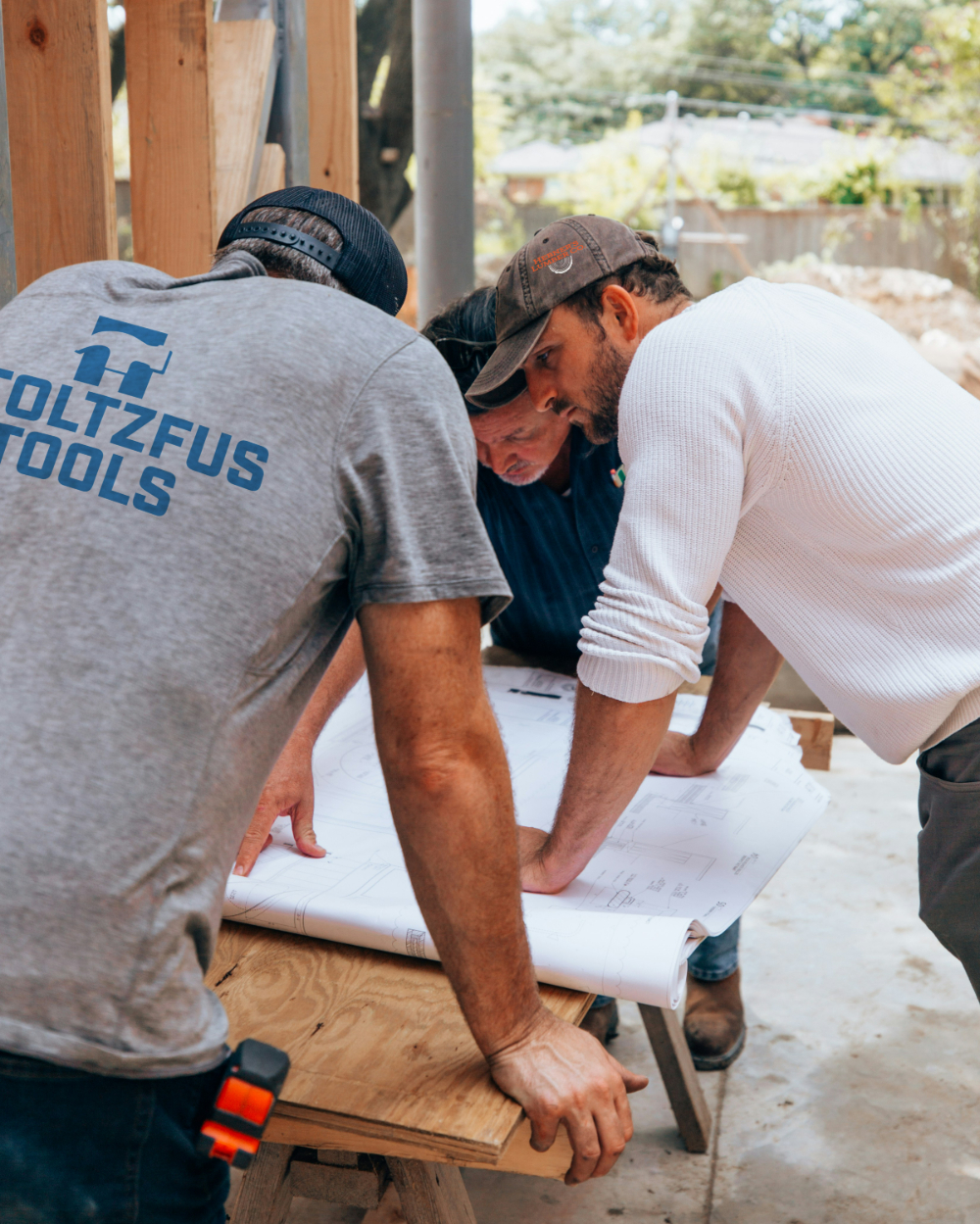
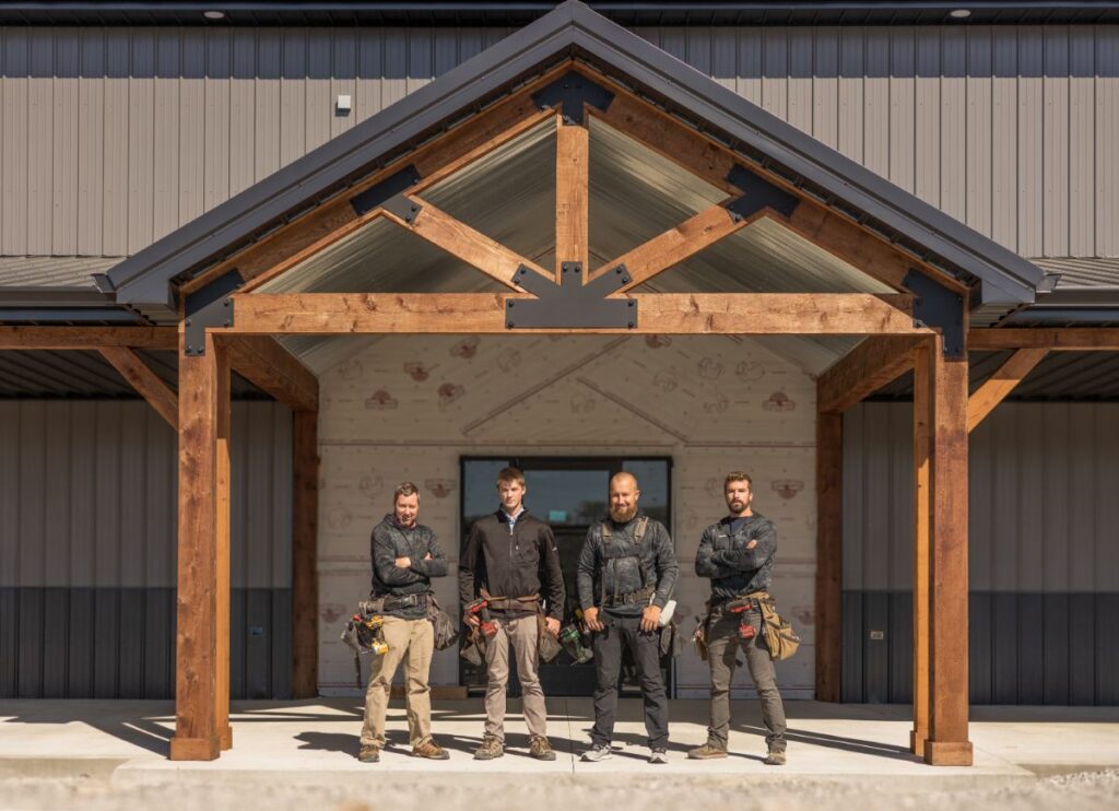
Mistake #13: Hiding Who You Are
What It Looks Like: A site filled with stock images, generic slogans, and zero personality. No photos of your actual team. No story. No sense of what makes your business different.
Why It’s a Problem: People buy from people. If your website feels faceless or overly polished, visitors might not connect with you, or worse, question whether you’re even local!
Fix It: Showcase your real team, your space, and your story. Prospects love to see a few authentic photos, and a short paragraph about why you do what you do can go a long way. We help businesses bring out their voice and values online, so visitors feel like they’re meeting the real you.
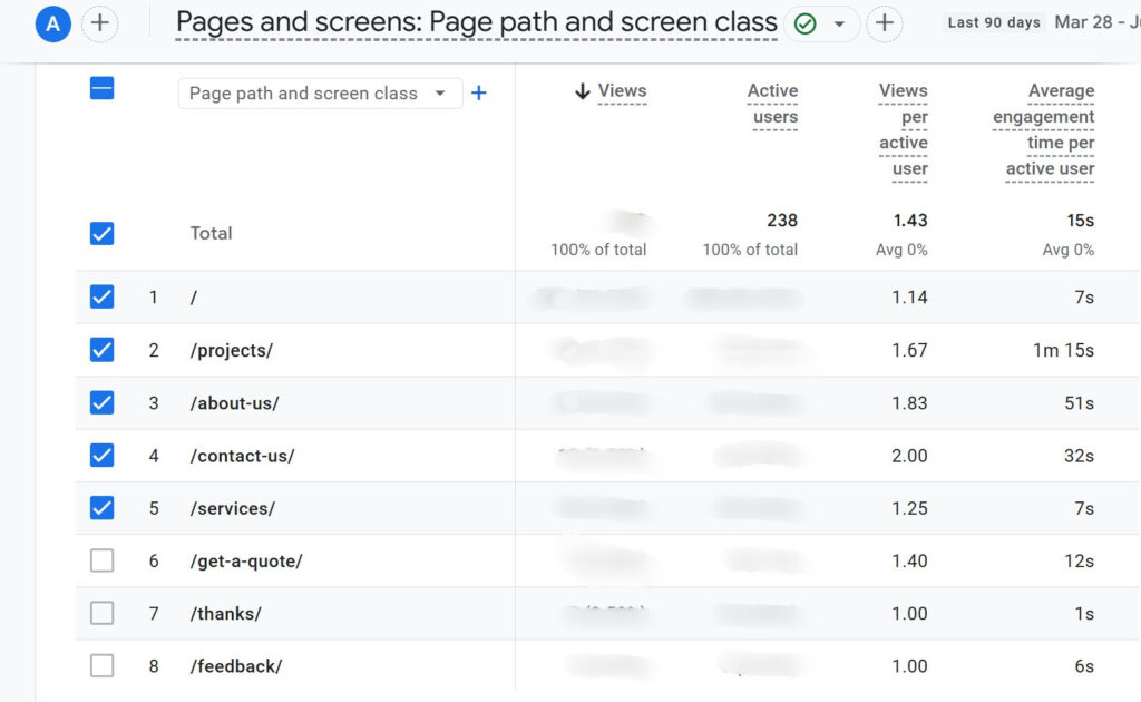
What so many of our customers don’t realize is that the About page is one of the most visited pages on their website – many times their second or third-most visited page! Southern Kentucky Structures used the photo above, and more, on their About page for authenticity with their people. The dwell time on their websites shows that their visitors spend time reading that page almost more than all of the others, even more than their core service pages. It’s just one example of how valuable authenticity is in this hyper-digital world we live in.
What Makes a Good Small Business Website in Lancaster?
Website design is about guiding users, strengthening brand identity, and making your business stand out. The right web design process blends user centricity with responsive web design, accessibility, and clarity.
We help small businesses in Lancaster build websites that feel clear, fast, and easy to use. Whether you’re starting fresh or cleaning up design mistakes, we’d love to help you build something that works. Let’s talk about your website with a free consultation – call today to learn more!
Don’t you love it when a project feels charged with energy from the very first brainstorm? That was the case when Black Diamond Biochar teamed up with Little Mountain Printing to create a brochure helping farmers imagine new possibilities for their soil, their animals, and their future.
Key Takeaways Direct Mail Can Outperform Online Ads: In crowded, competitive markets, direct mailers can have a higher ROI than online advertising. In this case,
Your business’ website is the first “virtual handshake” with your potential customers. If that digital handshake feels limp, awkward, or even dated, you might be sending the wrong message.
Key Takeaways A Website Sets the Tone: A beautiful, professional website is your first handshake with new clients—and it matters more than ever. Google Ads
Key Takeaways A Modern Website Reflects Professionalism: A fresh online presence builds instant credibility with high-value clients. Google Ads Connect Directly to Dream Customers: Strategic