Hand someone a flimsy, feather-light business card and you’ve already said much more than you might think. Customers form impressions in seconds – in as little as 50 milliseconds when it comes to recognizing faces – and your print materials are often the first, silent way that they begin to decide whether you might ever work together. Every detail, from the paper stock you choose to the colors on the page, tells people whether to trust you, question you, or forget you altogether.
The good news is, tangible print materials create a more memorable experience compared to digital media these days. You’ve got opportunities.
Quick Takeaways
- The psychology of print materials is simple: they act as subconscious signals. The thickness of your business card, the clarity of a font, the richness of a finish all send cues about your professionalism and values. Done well, print gives you instant credibility. Done poorly, it undermines you before you’ve even introduced yourself.
- Consider your audience before you finalize your print marketing material. If you make high-end cabinetry, luxurious cardstock can help convey that commitment to quality to your customers. Branding and colors can say a lot, from whimsical and airy to bold and tough. Your print materials’ design should pair well with the product or service you provide.
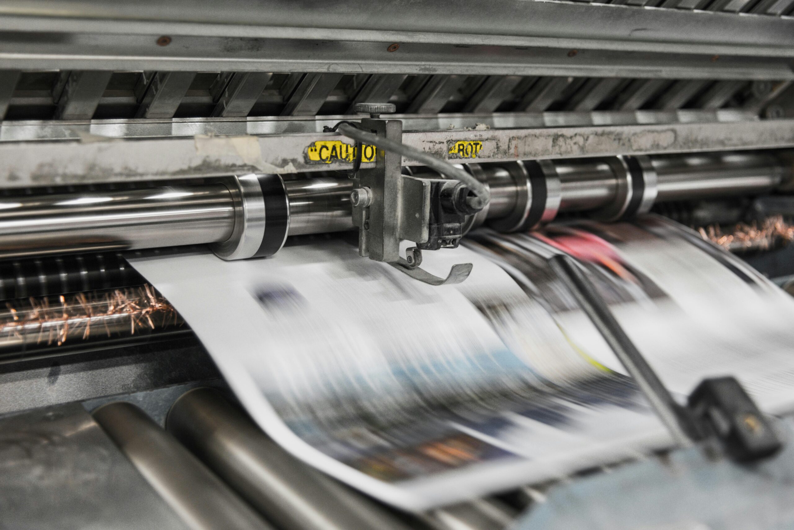
Print As A Silent Salesperson
Research shows that people form snap judgments in under 10 seconds, taking cues from everything including imagery to voice and tone. That means your catalog, flyer, or business card isn’t just a tool for sharing information, it’s also a credibility test. Customers usually can’t articulate it, but the weight of the paper, the sharpness of the print, and the balance of design and white space all add up to: Is this business worth my time?
A cohesive, polished look builds instant trust. A mismatched, inconsistent set of marketing materials plants doubt. In short: print is a silent salesperson working in your favor, or against you.
Here are some cues your print media might send about your business, and ways that psychology come into play.
Paper Psychology: The Feel In Their Hands
Thickness And Weight
Pick up a card that bends like notebook paper and we assume cost-cutting. Pick up one that feels substantial and sturdy, and we assume stability. Thickness communicates authority without a word spoken.
Coatings And Textures
Glossy finishes project energy and boldness. Matte finishes feel smooth, restrained, and modern.
Add a textured surface, and suddenly your piece feels boutique and thoughtful, like something you’d expect from a craftsman rather than a chain store.
Eco-Friendly Choices
Recycled stock, unbleached paper, and subtle eco-textures send cues of responsibility. For values-driven buyers, that choice becomes a trust signal that says: we think about more than profit.
Fonts & Typography: The Voice On The Page
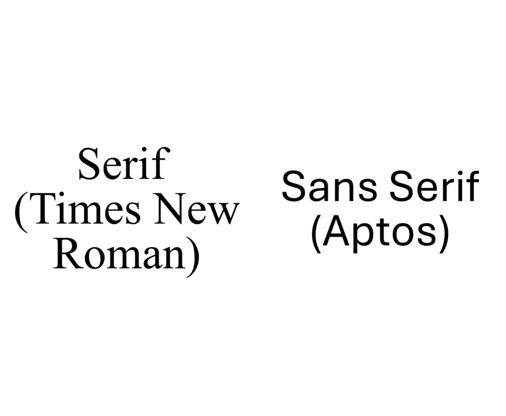
Serif vs. Sans-Serif
Serif fonts (think Times New Roman) convey tradition, reliability, and heritage. Sans-serif fonts (like Helvetica) give off a modern, approachable vibe. Given the immense number of fonts out there today, your choice isn’t arbitrary, it changes the way people hear your “voice.”
Script & Decorative Fonts
Script fonts add flair and personality, but when overused they can frustrate readers. A fancy swirl is charming as an accent, but confusing as a headline. Humans are visually lazy, and your prospects won’t work hard to read what you have to say. If they can’t digest your font choices in milliseconds, you run the risk of losing their attention.
The Power Of Consistency
Using four different fonts on the same brochure is the print equivalent of showing up to a meeting with mismatched socks. People notice. A cohesive typographic system – often led by a standardized stylebook of graphic design rules for your company – communicates professionalism and attention to detail.
Color Choices Are More Than Decoration
Common Associations Of Colors
While these aren’t hard and fast rules, there are some common “feelings” we get from colors.
- Blue tends to signal trust and dependability (no wonder banks love it).
- Red signals urgency, passion, or clearance pricing.
- Green connects to health, growth, and environmental consciousness.
- Black and white convey luxury and timeless elegance.
Color psychology only works if it matches your brand identity. A company that uses one shade on its logo and a different shade in print looks inconsistent. Customers may not consciously clock it, but the mismatch weakens brand recall. Using consistent color palettes in print enhances brand recognition among consumers.
Interestingly, sometimes it’s about the color NOT on the page, too. Effective use of white space in design can enhance clarity and focus on key information. White space helps to “set off” key elements of your design, and it can be used to make bold statements about simplicity. White space around color elements can also make designs feel more professional and easier to read.
Finishes & Special Effects: Texture Meets Psychology
Foil & Embossing
Foil stamping and embossing scream exclusivity. They add weight and tactile depth, turning a simple card into something people actually want to hold onto.
Spot UV & Coatings
Spot UV creates glossy highlights that catch the eye against a matte background. Protective coatings don’t just keep your materials from smudging — they signal durability and polish.
The Danger Zone: What Bad Print Says (Even If You Don’t Mean It)
- Thin paper stock = cutting corners.
- Inconsistent branding = lack of attention to detail.
- Overloaded design = lack of clarity and confidence.
Even if your product or service is top-notch, poor print quietly suggests otherwise.
How To Make Print Work For You
How do you make sure your print materials are working as hard as you do?
- Audit your current materials: does the paper weight reflect your pricing? Do the colors match your branding? Does your typography feel consistent?
- Partner with printers who understand both design and the psychology of print. That means print shops who do both in-house. Better yet, a printing company that does marketing strategy too.
- Update pieces that send mixed signals. Sometimes small design changes often yield the biggest credibility gains.
At Little Mountain Printing, we help businesses near and far choose the right print materials and design elements with confidence. From paper stock to finishes, we guide you toward print marketing that speaks for you and says the right things. Customers might never say, “That card felt too thin,” but they’ll feel it. And feelings guide trust.
The takeaway is simple: your print materials are your brand’s first impression. Give us a call to learn more about our capabilities and to get marketing materials that will leave a lasting impression.